Towards the end of 2019, we got the opportunity to work in a listed stately home that had been converted into apartments in the New Forest. Our client, who lived abroad, trusted us to choose colours and carpets that would compliment the historic features and age of the building, while at the same time bringing it into the modern 21st century.
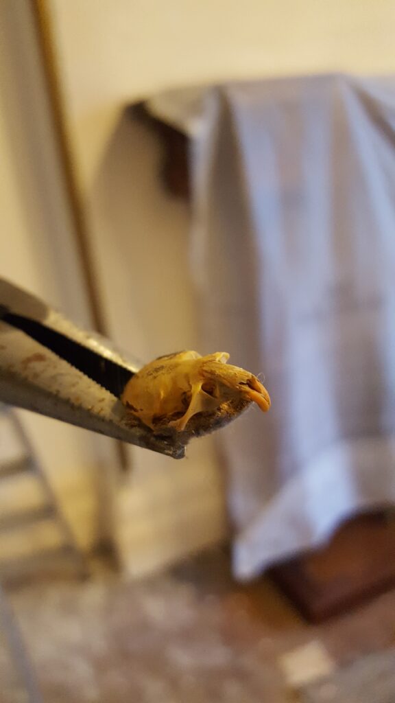
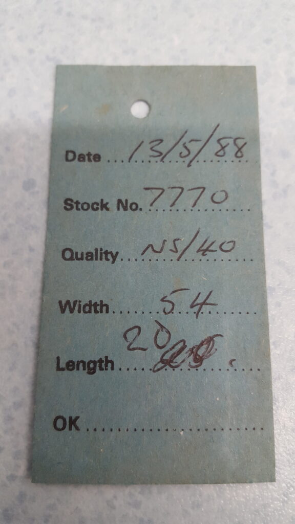
Our first major task was to rip up all the thread-bare carpets and brittle underlay from the Drawing Room, Master Bedroom, Second Bedroom, Bathroom and Hallway. The most shocking revelation that came out of this task was finding a mouse skeleton hidden underneath one! We even found an old carpet ticket stub from 1988, proving to us that the carpets had been there for 30 years!
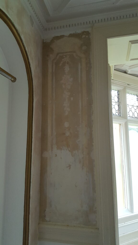
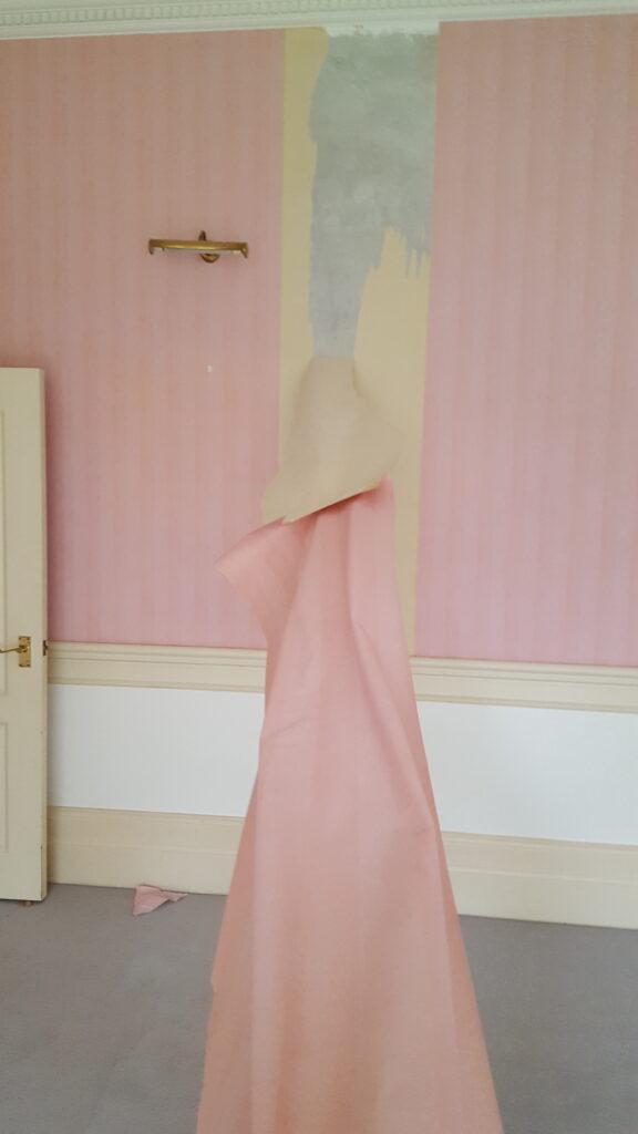
The next job was to remove the dated wallpaper from the Drawing Room and Master Bedroom. This was so satisfying, especially when whole sheets of wallpaper were coming off in one big piece. Underneath a section in the Drawing Room was the remains of an old stencil that would’ve once looked very grand in the space.
We then began the labour intensive job of sanding all the woodwork, which had turned yellow with age. Around the huge windows and exterior doors the paint was flaking and in dire need of attention in each room.
The Colours!
We managed to create a neutral colour scheme that worked through the entire flat and once our clients had approved of the colours we had chosen, we began painting! The intricate ceiling in the Drawing Room was sprayed to get a beautifully smooth finish. The ceilings in the apartment were painted in Little Greene ‘Rolling Fog – Pale’, which has some warm grey undertones, perfect for the high ceilings to help soften the spaces. All the woodwork in the apartment was painted in Benjamin Moore ‘Classic Grey’ Aura Eggshell, which compliments the ceilings perfectly.
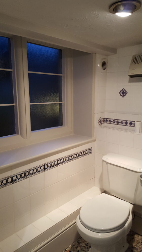
The only room where we chose to break the colour scheme was the bathroom. This space was small with low ceilings and the bathroom fittings and tiles were dated, so we chose a colour to warm the space and give it some more depth. The colour we chose was a Benjamin Moore colour called ‘Wish’, we chose to use this on the ceiling and woodwork to try and make the space feel bigger. It has warm earthy tones in this colour, which soften the harsh cold whites that take up the majority of the space.
The Drawing Room!
This room has some stunning features, including a beautiful fireplace, intricate ceiling, ornate metal grates in the floor, gold framed alcoves and a built-in-bookcase. The clients wanted to retain the gold frames around the alcoves and we knew instantly we wanted to use a charcoal grey to make the alcoves become a feature either side of the fireplace. This grey was a Benjamin Moore colour called ‘Kendall Charcoal’, which really highlights the gold. The remaining walls were painted in a subtle pink Benjamin Moore colour ‘Knitting Basket’, which brings out the pink and purple tones in the marble fireplace.
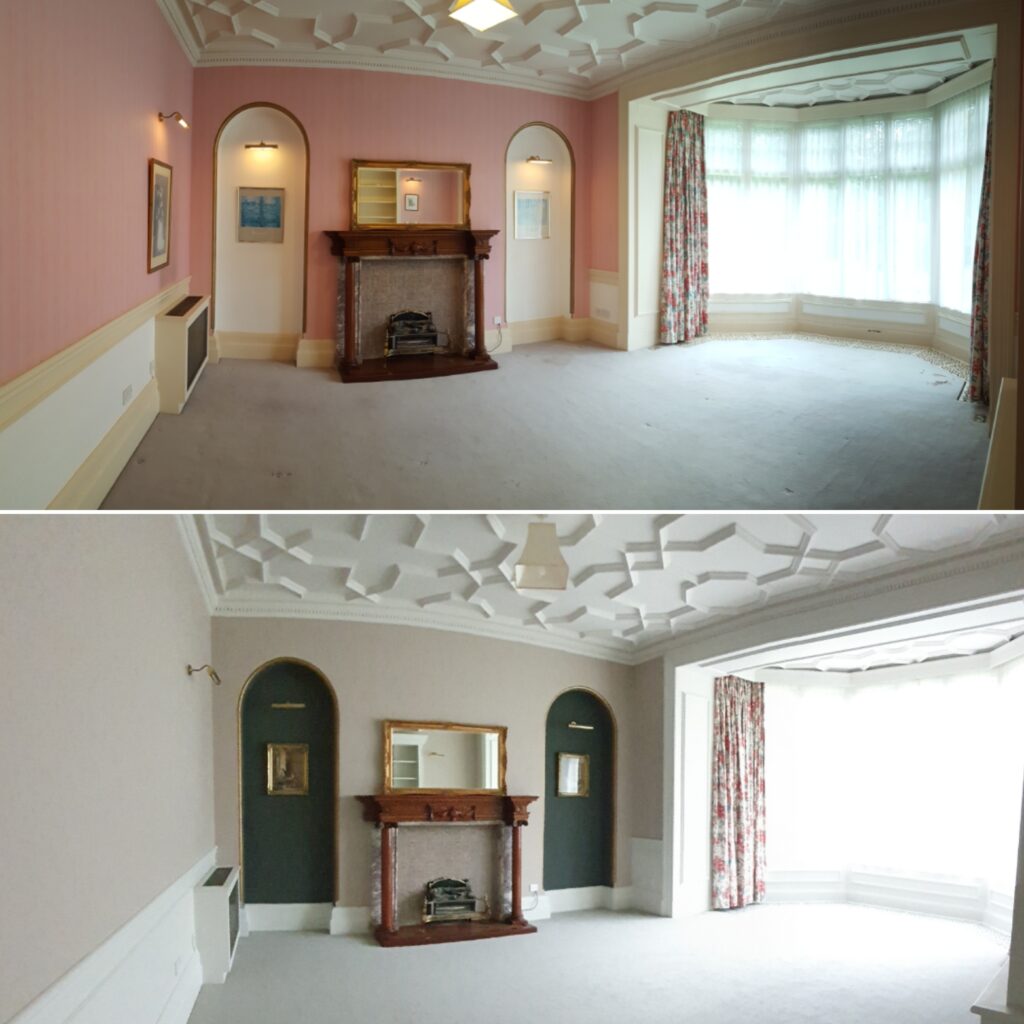
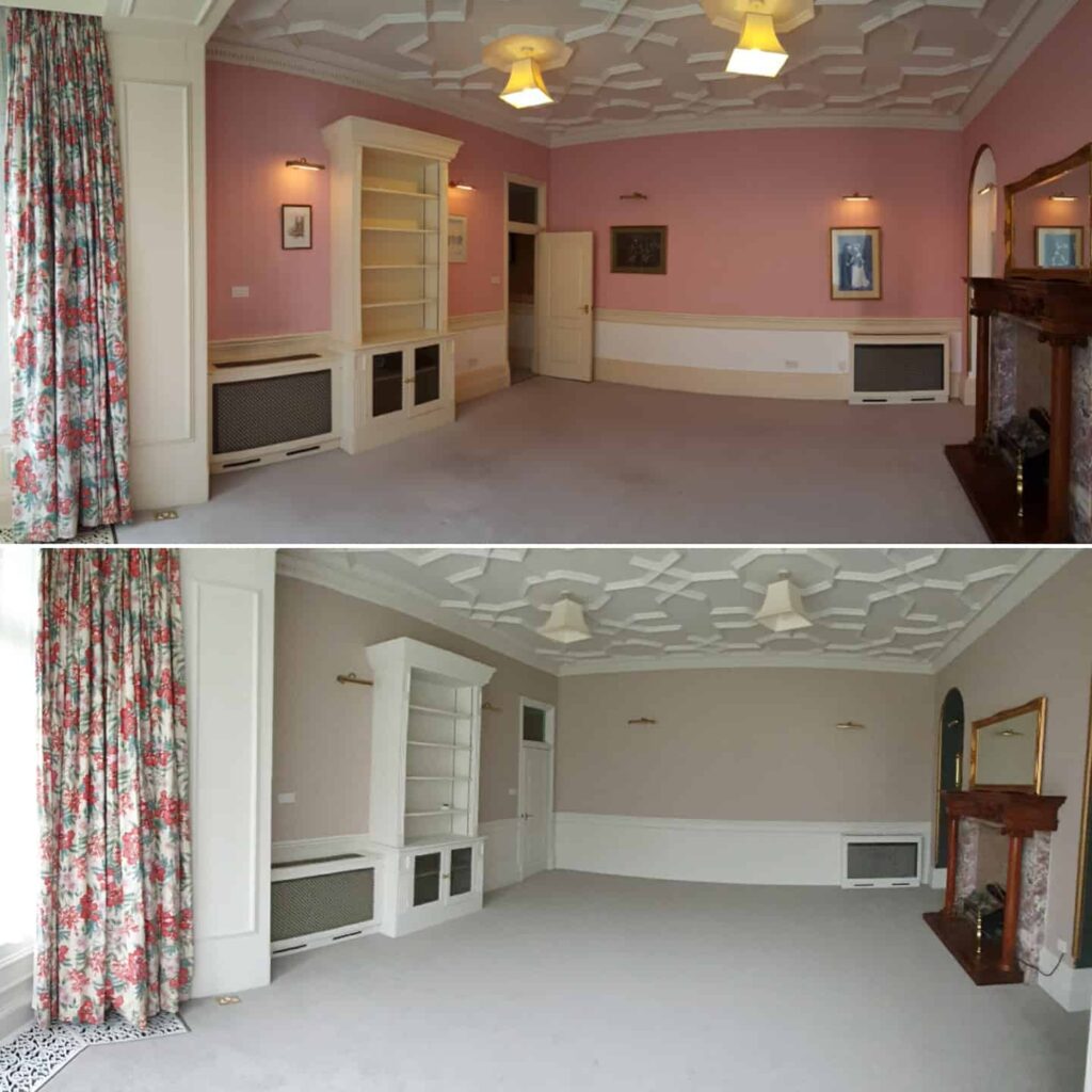
We painted the bookcase and radiator covers the same as the woodwork. This room had oversized skirting boards and panelling up a third of the wall, which we chose to do all in the same colour to eliminate the border effect that was previously there. There was old, drippy paintwork that needed to be removed on the grates in the floor. We took them away to be sand-blasted and then sprayed to match the woodwork.
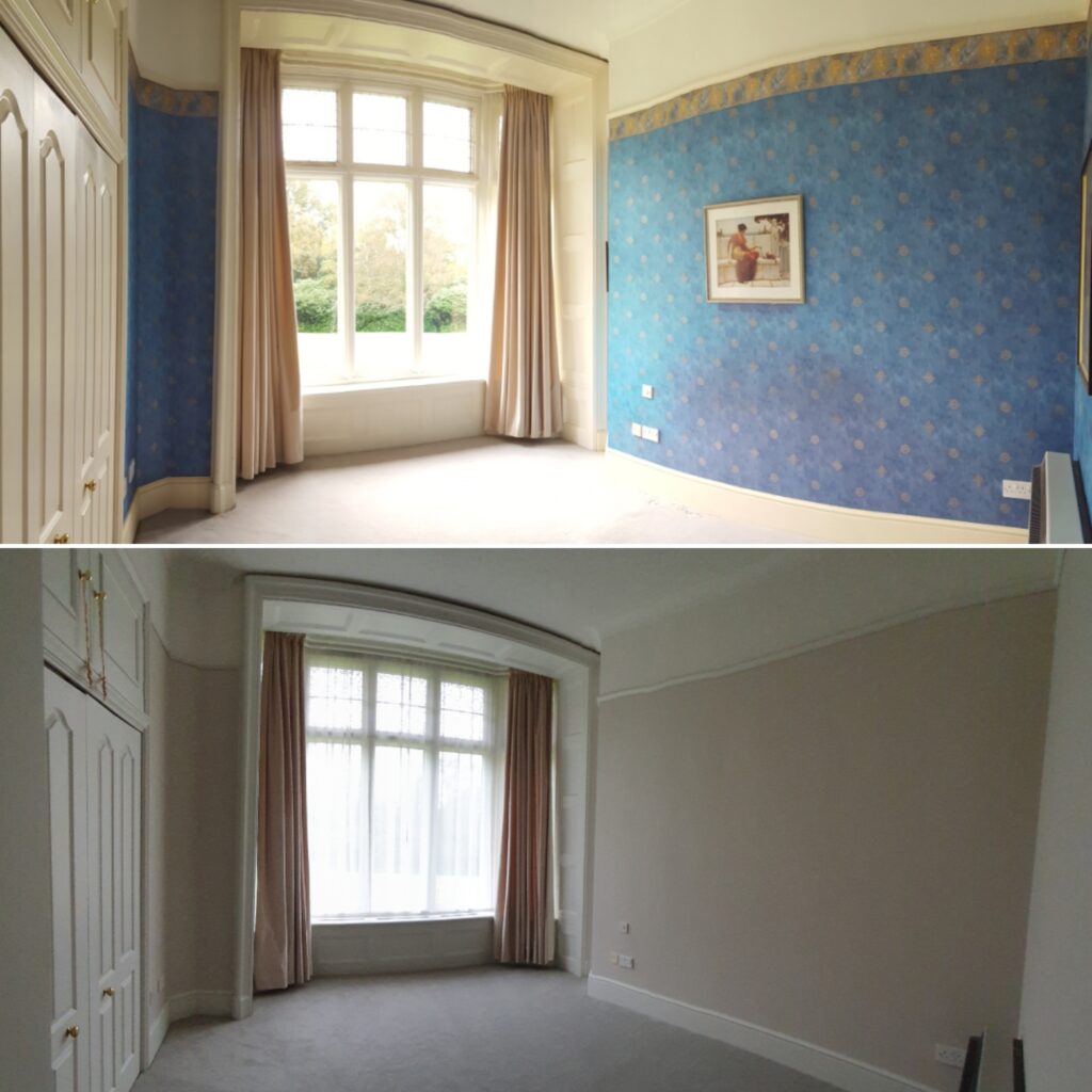
The Master Bedroom!
Although this room was smaller than the Drawing Room, it still held similar features, such as the large bay window with window surround. The faded blue wallpaper was removed, including the wallpaper inside the built in cupboard, due to the poor condition of it. We knew the existing velvet curtains were being kept and the colour we chose was a soft neutral that complimented them, as well as being a relaxing colour for a Master Bedroom. This was a Little Greene colour called ‘Rolling Fog – Mid’.
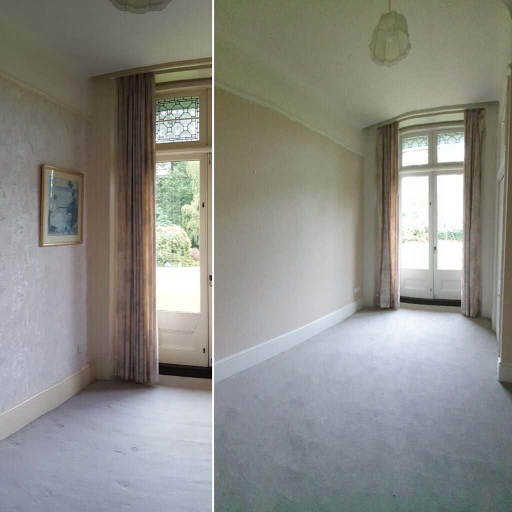
The Second Bedroom!
In this room, the clients insisted on keeping the wallpaper, however it was tired and wasn’t in keeping with the rest of the apartment, we suggested a compromise, keep the wallpaper, but we paint it, they agreed. This added an element of texture into this small room while keeping the clients costs down. The colour we chose for this room was another warm Benjamin Moore neutral with a slight earthy tone to it, called ‘Carlisle Cream’. This made the room feel bigger and brighter.
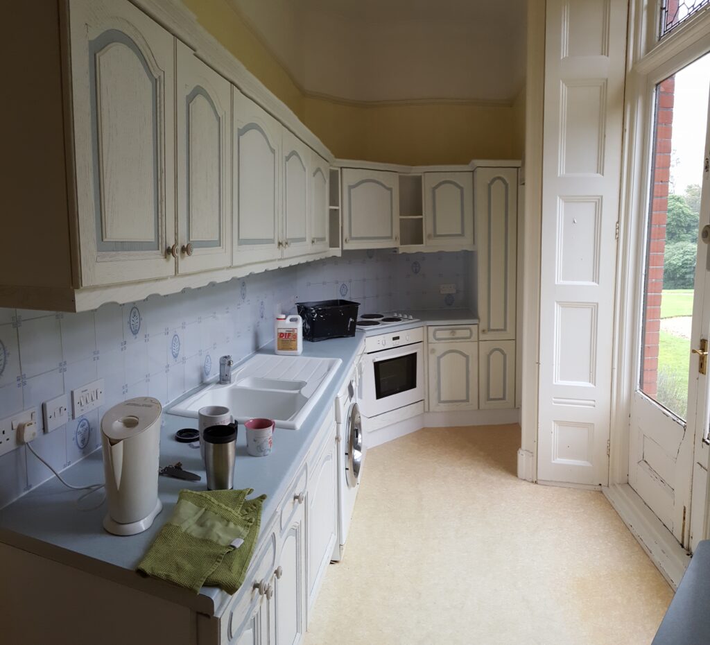
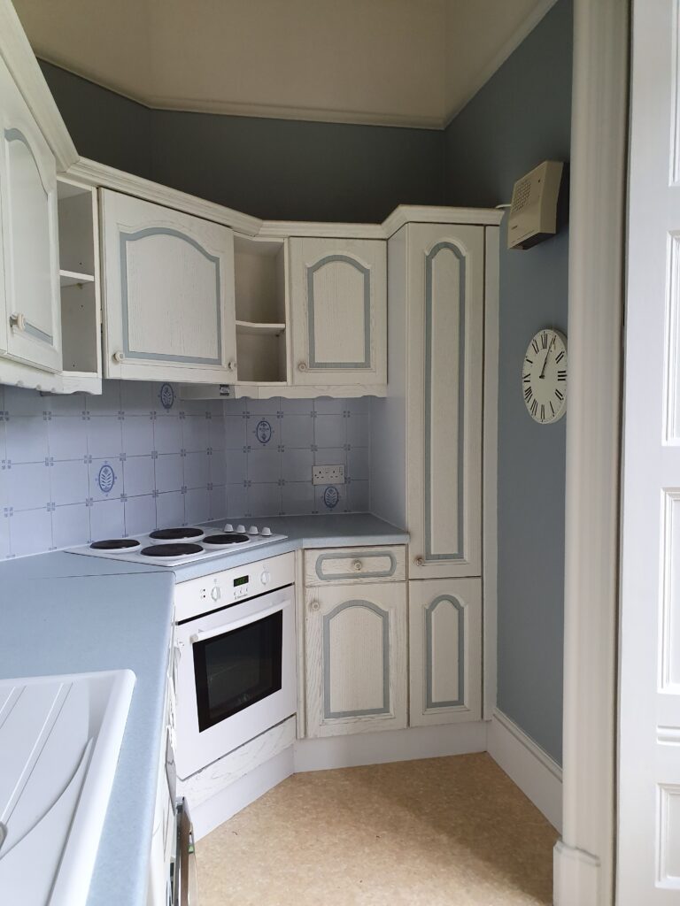
Kitchen!
This room was a very dated space, with yellow walls and old white and blue kitchen units, with blue tiles above the worktops. The clients chose to keep the units and tiles for the time being and just focus on the remaining elements in the room, which included double doors leading outside with huge bi-fold shutters. Knowing that the units and tiles were staying it was time to chose a wall colour that would compliment them, a Benjamin Moore colour was settled on called ‘Marina Gray’ – a soft and warm blue, which gives the kitchen a new lease of life.
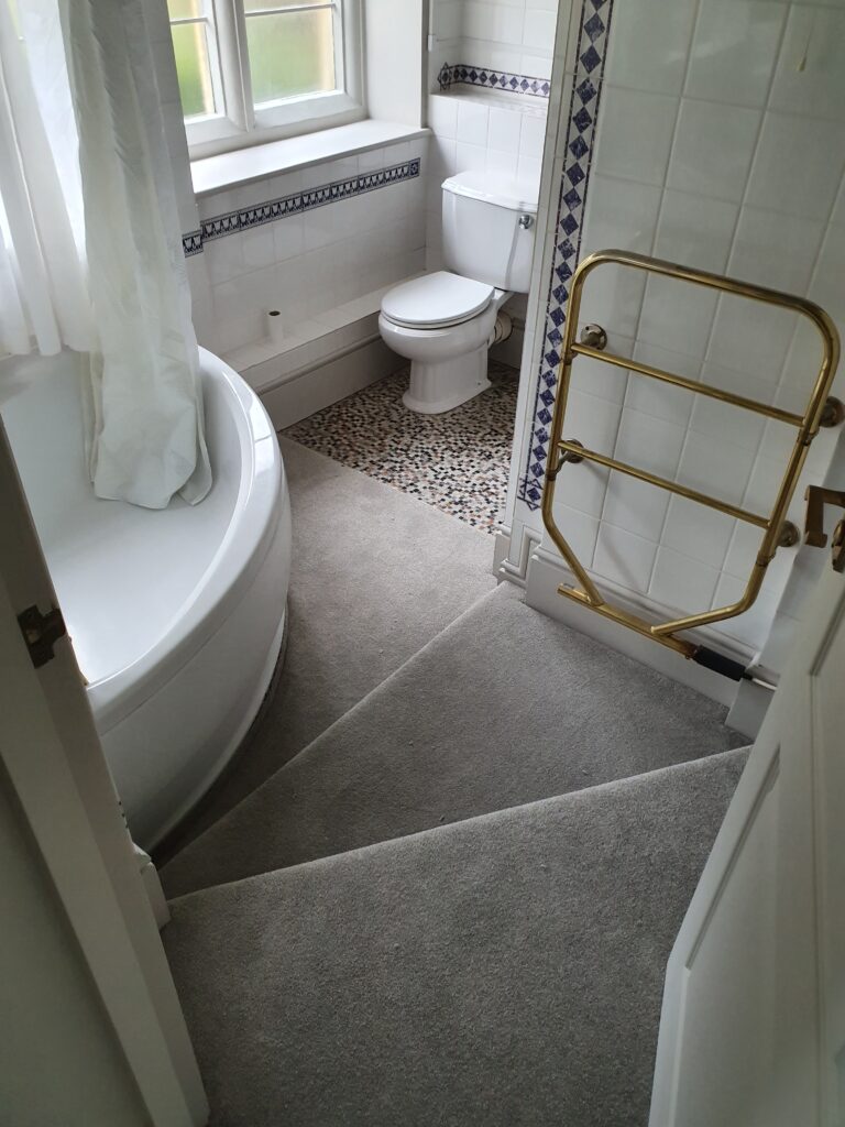
Bathroom!
The bathroom was tucked away down a couple of steps – a very quirky layout – as it was built underneath the manor house communal staircase. The window sills and frames had flaking paint from years of poor ventilation in a small, steamy room. They required a lot of TLC to restore them but they came up beautifully. We painted all the woodwork in the same colour (Benjamin Moore ‘Wish’) as the walls and ceiling to make this small space appear bigger.
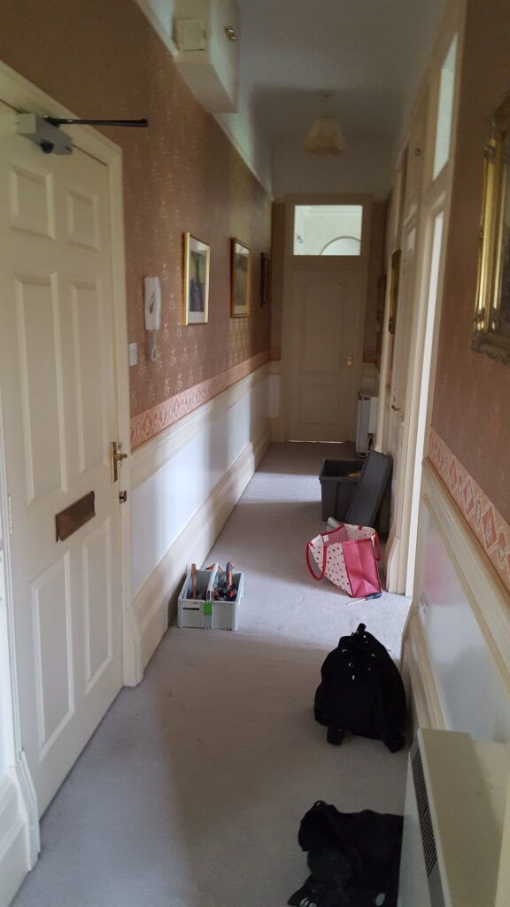
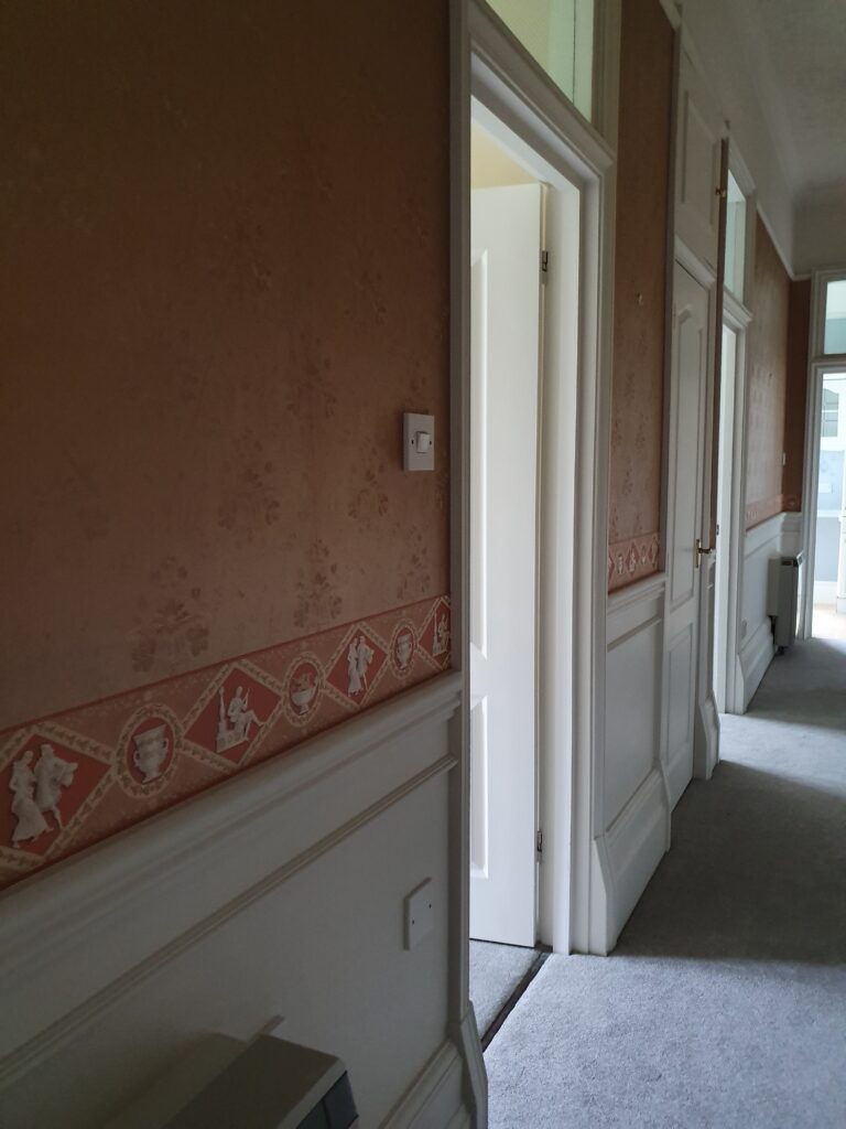
Hallway!
Our client wanted to keep the wallpaper in the hallway – some areas were peeling away so we used our wallpaper adhesive to make it look as good as new. The woodwork gave this entry space a more inviting feel as it dominated the area with seven doors and large panelling. Together with the new carpet – this hallway instantly brightened and became a wonderful entrance to such a quirky apartment.